Katharine Nanke
Brand & Creative Strategist
I turn brand identity into strategy, story, and visual experience — clearly, intentionally, and with a point of view.
Open to full-time remote roles in brand strategy, content strategy, and creative communications.
MOMATRIX
I'm a brand strategist and creative director who builds brands that are strategically grounded and visually impossible to ignore. My background is in Strategic Communications, Media Design, and Business — which means I think in systems and design in aesthetics. I specialize in brand identity, campaign strategy, and content that makes a brand feel like itself, only louder.

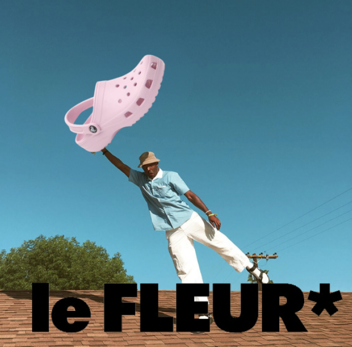
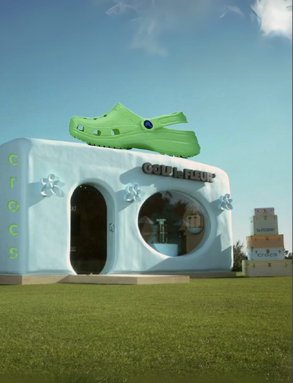
Tyler the Creator
GOLF le FLEUR* x CROCS
The collaboration that’s absolutely YONKERS.
Two iconically creative brands clash in the best way possible.
This conceptual project blends Tyler the Creator’s GOLF le FLEUR* with CROCS. An unexpected match that’s hard not to love.
The result?
A bold fusion of visual storytelling, campaign strategy, and immersive design that sparks both wonder and desire.
Spec Concept / Creative Direction / Experiential
Eva Crescent Moon Snowshoes
Spec Work — Conceptual Ad Campaign
Brand Strategy / Advertising / Visual Identity
So light, it’s like they’re not even there.
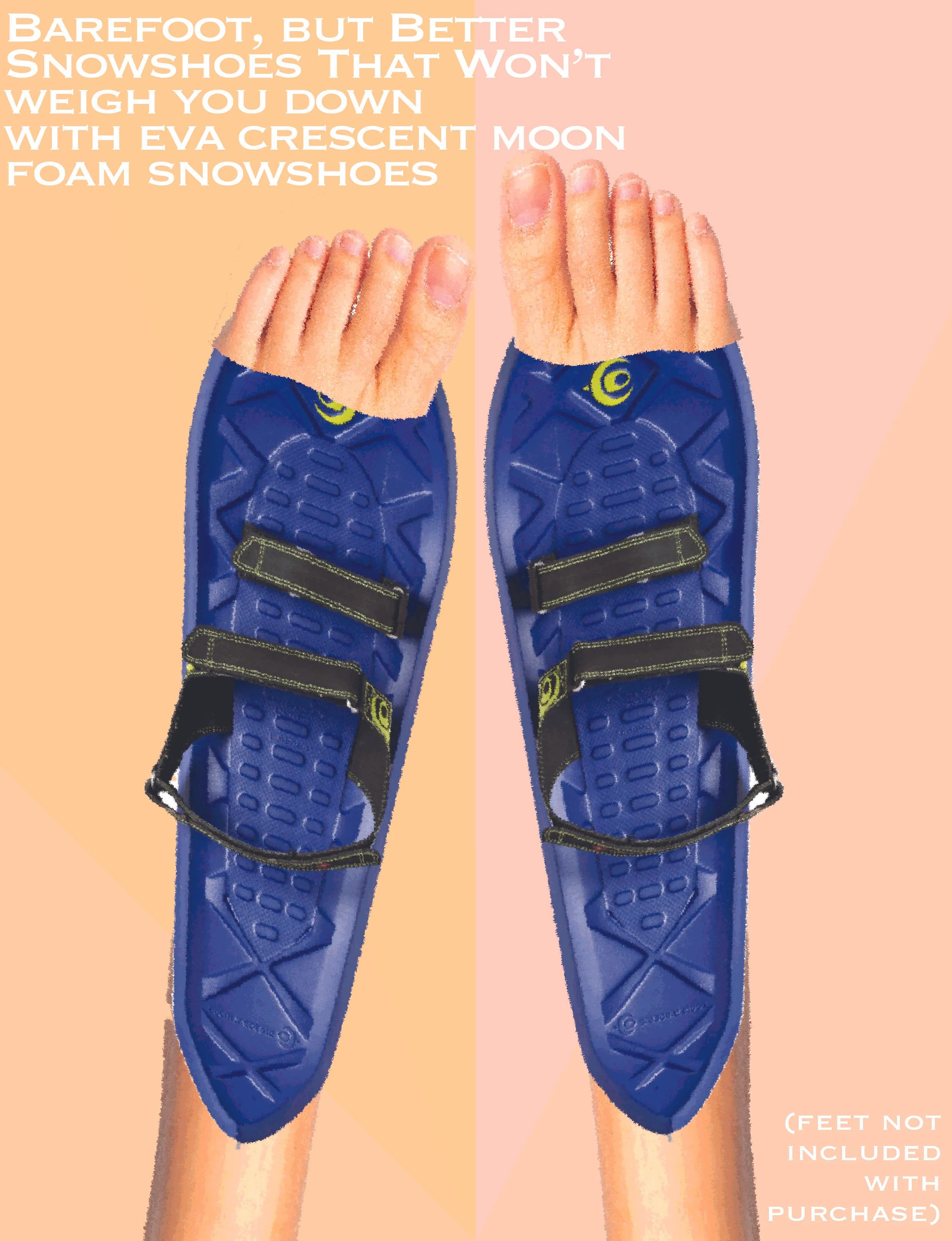
What if you could walk on clouds, pillows, or nothing at all?
This 3-part ad series reimagined traditional snowshoe marketing through surreal visual metaphors that emphasized the foam design’s unexpected lightness and comfort.

Eunoia means beautiful thinking. This concept explores how spiritual wellness, clarity, and aesthetics can intersect to create intentional, energy-aware brands. Rooted in strategy and symbolism, Eunoia blends celestial visuals, brand voice, and mood-based design to awaken mindful experiences.
Brand Strategy for a Modern Mystic™
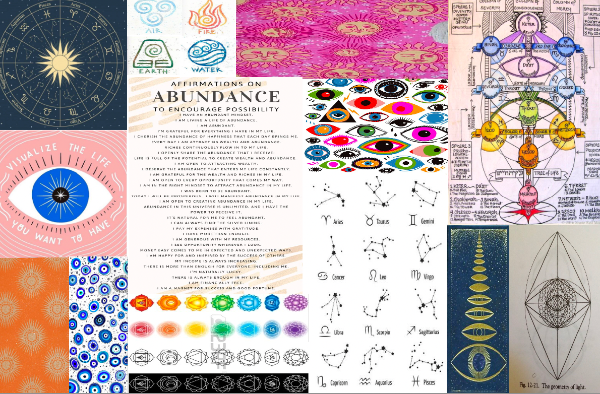

EUNOIA'S TIME PORTAL
This is an ongoing spec concept exploring spiritual wellness branding. The brand strategy, visual identity, and messaging architecture are fully developed — the product is conceptual.